Windermere Peninsula Properties
30 NE Romance Hill Road
Belfair, WA 98524

MIKE MOSTYN, CRS
E - Mostyn@Windermere.com
W - www.mikemostyn.com
S - www.BelfairWindermere.com
WA. License #106546
The South Sounder is an annual Washington State-based newsletter sent in April to every owner of Mason County waterfront property on Puget Sound.
For those who don't get the newsletter or find the Internet more convenient, this website has been created.
Thank you for your interest. If you have any questions, comments or suggestions, feel free to contact me.

2015 South Puget Sound Saltwater Home Values
- Allyn/Victor - Case Inlet (Allyn / Grapeview / Victor)
- Bremerton (Sinclair Inlet / Lower Dyes Inlet)
- Fox Island Gig Harbor Community
- Gig Harbor - (Narrows / South Colvos Passage)
- Hale passage (Kapachuck to the Narrows)
- Hammersley Inlet - (Hammersley Inlet and Oakland Bay - Shelton)
- Harron Island - Case Inlet Island
- Harstine Island - A Shelton Community
- Henderson Bay - Carr Inlet / Rosedale / Raft Island (Gig Harbor Communities)
- Hood Canal North - Hoodsport to Brinnon/Seabeck)
- Hood Canal South - Belfair to Union/Tahuya)
- Key Peninsula - Victor / Longbranch / Lakebay / Home / Glencove
- North Colvos Passage - Maplewood / Olalla / Southworth / Manchester
- Pickering Passage - Grapeview to Hammersley Inlet
- Port Orchard - Sinclair Inlet
- Treasure / Stretch Islands - Allyn Communities
- Silverdale - Upper Dyes Inlet
"Averages" are useful only by break the South Sound into real estate areas where diversity's in common. For each beach area, there are four charts from actual sales data taken directly from the NWMLS to tell the story of each beach and its behavior in 2015.
"Scattergram Pricing Chart"
Each dot is an actual sale. The vertical axis is price and the horizontal is its square footage. Given all these points of sale, the blue line is a mathematical average of the "price per square foot" at any given size. This will give you some idea of the cost of an area home by foot.
"2015 Time to Sell"
Here, I tracked many “Days on Market” each sale required as a function of price. For those interested, you can combine the information from this chart with the "2015 Buying Patterns" chart to get an idea when best to list a home.
"2015 Buying Pattern"
This chart documents "Buying Patterns" from the perspective of price to the date it sold. This is an attempt to determine what time of the year what is spent on waterfront housing. Remember, these dates represent when a sale closed and recorded, not when the sellers agreed to an offer. Subtract about 40 days to get when the seller agreed to their final offer.
“What are the Odds of Selling Your Home?”
What percentage of homes for sale in a particular area actually sold? For example, on Harron Island, there were seven waterfront homes available for sale in 2015. One sold which means the odds of selling a waterfront home on Harron Island in 2015 was 14%. In this chart, the blue bars represent what sold, red is those homes that either the listing expired or cancelled, green is homes still for sale and yellow is sales that are pending.
This is not just about demand. It also speaks to supply, what are homeowner and buyer expectations of property values and suggests the pressures this may have on pricing.
THIS IS THE SOUTH PUGET SOUND
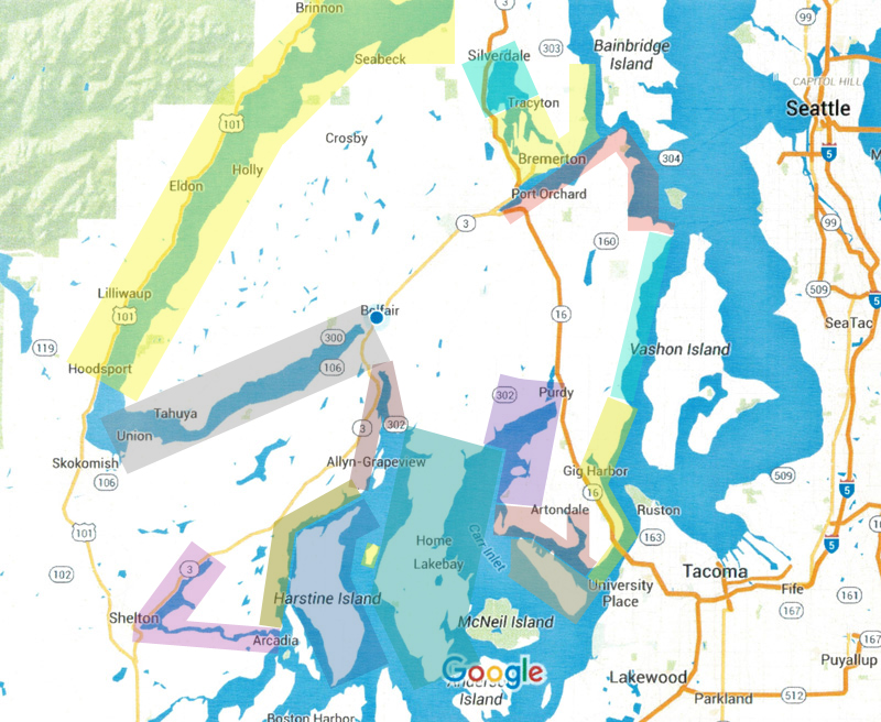
Click below on the area you are interested in:
- Allyn/Victor - Case Inlet (Allyn / Grapeview / Victor)
- Bremerton (Sinclair Inlet / Lower Dyes Inlet)
- Fox Island Gig Harbor Community
- Gig Harbor - (Narrows / South Colvos Passage)
- Hale passage (Kapachuck to the Narrows)
- Hammersley Inlet - (Hammersley Inlet and Oakland Bay - Shelton)
- Harron Island - Case Inlet Island
- Harstine Island - A Shelton Community
- Henderson Bay - Carr Inlet / Rosedale / Raft Island (Gig Harbor Communities)
- Hood Canal North - Hoodsport to Brinnon/Seabeck)
- Hood Canal South - Belfair to Union/Tahuya)
- Key Peninsula - Victor / Longbranch / Lakebay / Home / Glencove
- North Colvos Passage - Maplewood / Olalla / Southworth / Manchester
- Pickering Passage - Grapeview to Hammersley Inlet
- Port Orchard - Sinclair Inlet
- Treasure / Stretch Islands - Allyn Communities
- Silverdale - Upper Dyes Inlet
